Anna Harding
Designs
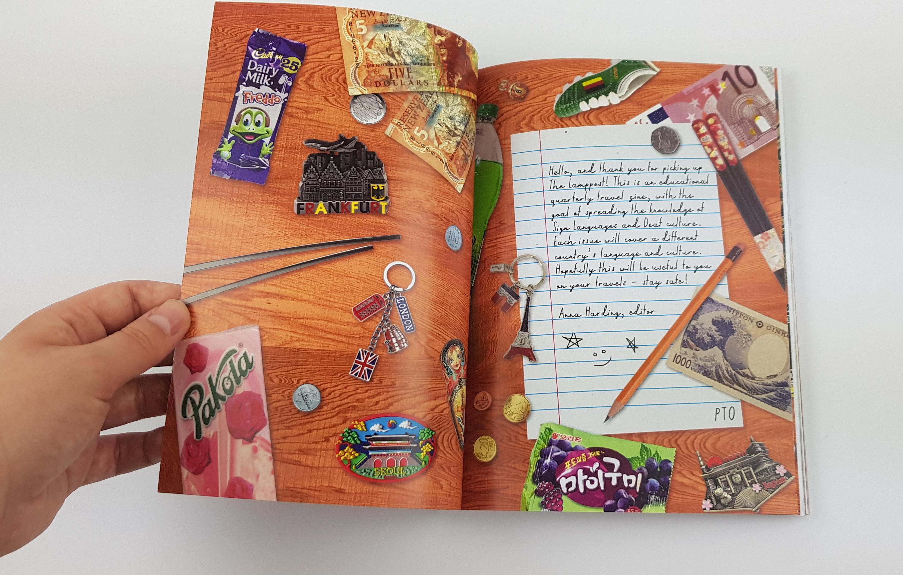
The Lamppost
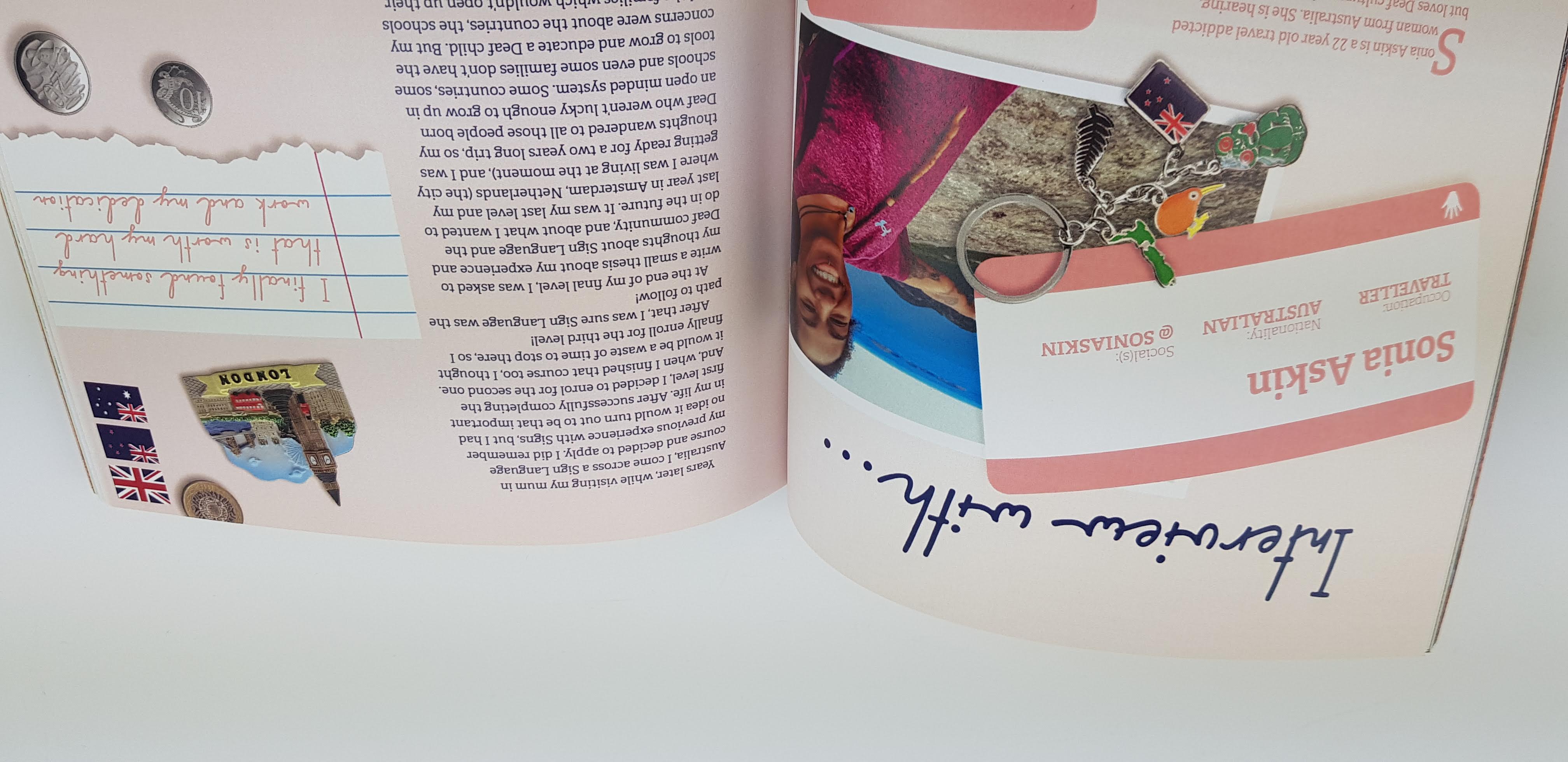
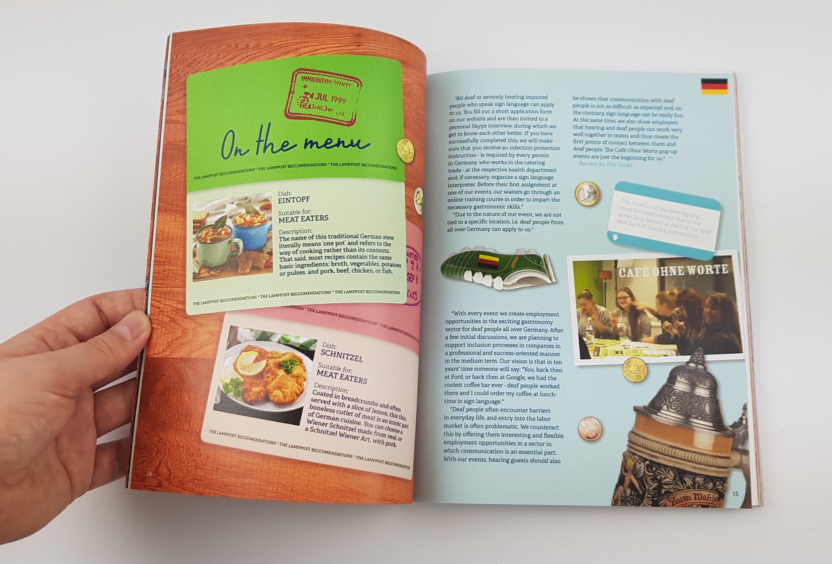
The Lamppost is a Sign Language and Deaf culture magazine, aimed at users and learners alike. Including a teaching section for learners, with coherent illustrations of hands to demonstrate the signs, and will also cover Deaf culture – such as Deaf media, events and attractions.nd learners alike. This magazine is designed to be beneficial for both deaf and hearing people, as the main aim is ‘Shedding light on Sign’ – this can be anything from recommending a Deaf-run café, to discussing a country’s new advancements in Deaf rights or technology, so it stays interesting and important for both sides to read.
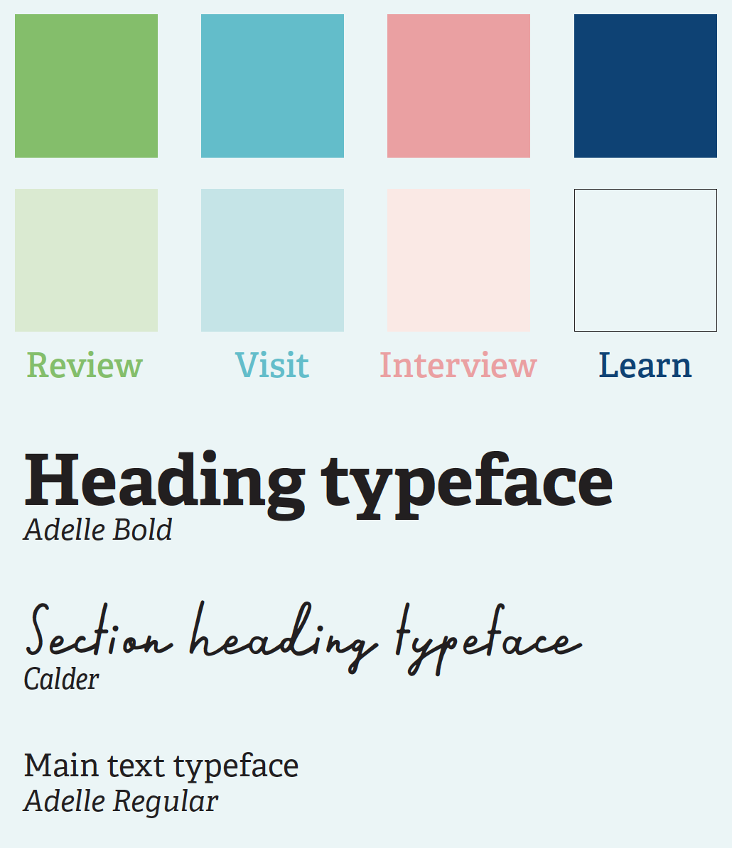
Each issue will discuss a different country and culture, adapting to the topics discussed, so consistent branding is needed to connect the series. The typography of hierarchies and the colour-coding of sections stay the same throughout all issues, so that recurring readers aren’t confused. However, the masthead and spine colour will change per issue. The size of the magazine is small and compact, almost pocket-sized, as it is intended for travellers to take it with them out into the real-life situations based on what they’ve read, e.g. visiting recommended destination.
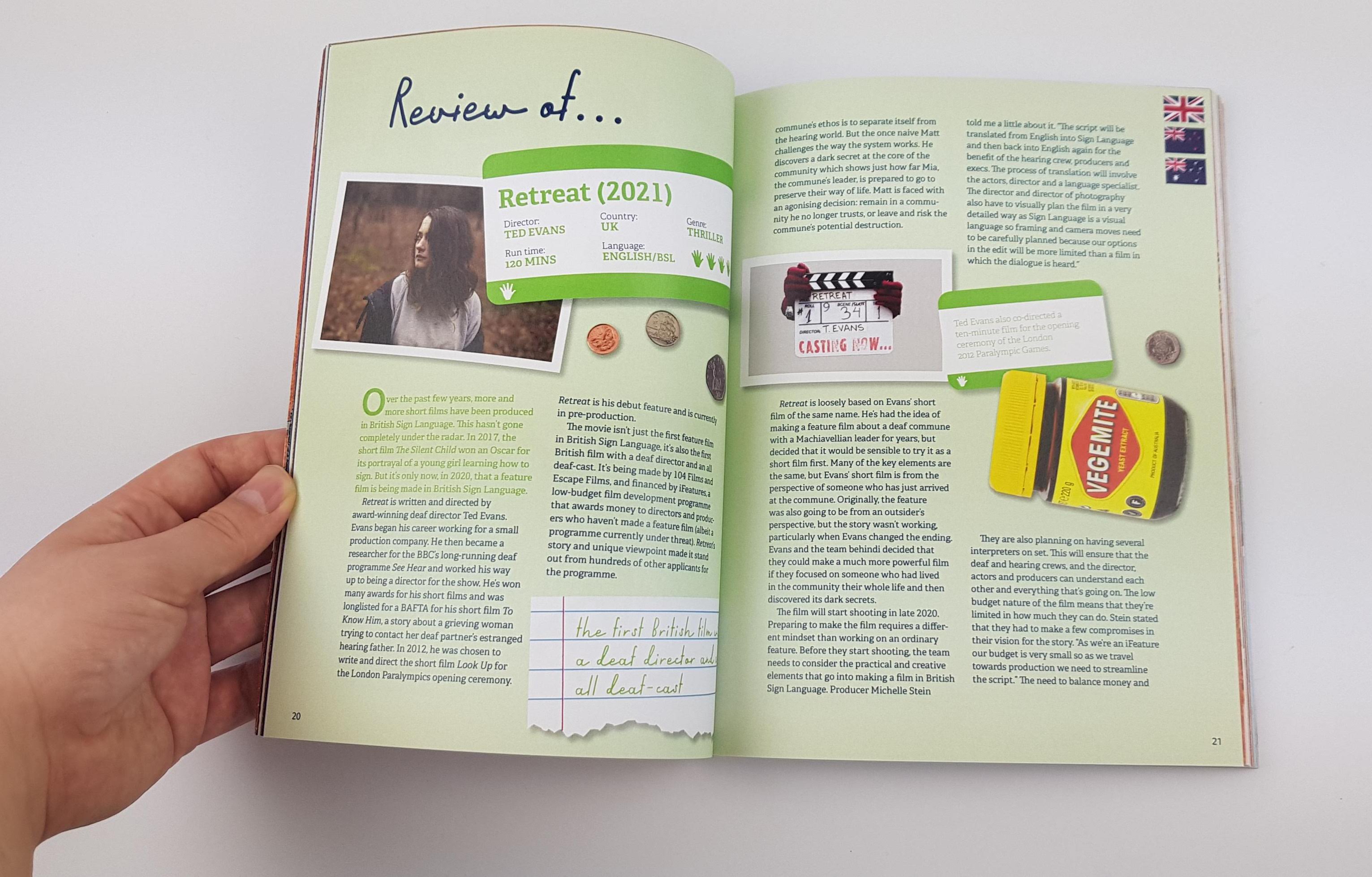
The aesthetic of The Lamppost is cluttered and scrapbook-esque, almost photomontage. By using a collage of items and ephemera which relate to each specific topic – for example, in the first issue, each topic is a different country, so the related items will also be culturally relevant to said country. This creates a fun and quirky energy, which is quite personable and friendly – very fitting with the tone and message of this publication.
The aesthetic of The Lamppost is cluttered and scrapbook-esque, almost photomontage. By using a collage of items and ephemera which relate to each specific topic – for example, in the first issue, each topic is a different country, so the related items will also be culturally relevant to said country. This creates a fun and quirky energy, which is quite personable and friendly – very fitting with the tone and message of this publication.