Anna Harding
Designs
SubZero Ice Cream Rebrand
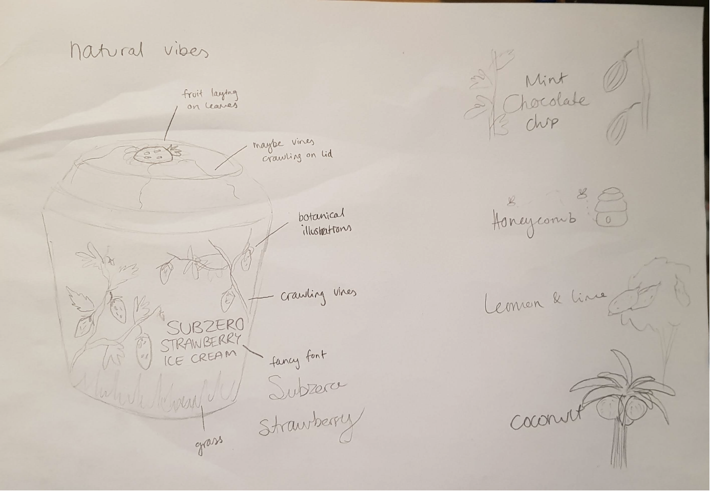
Subzero Ice Cream is a desert parlour based in South Wales which has recently begun selling their ice cream tubs in regular shops and supermarkets. Their packaging works perfectly for the parlour, where they use ‘look-in’ chest freezers to display the product, since the flavours are on all of the lids of the tubs, making it very easy for customers to find the flavours they want/browse for new ones. However, with their recent expansion into general stores, which more commonly use fridge freezers to display their frozen product, this style of packaging is extremely ineffective. I decided to rebrand their packaging to be more widely marketable.
The key feature of the designs are the ‘flavour windows’. They allow for the ice cream itself to become decoration, whilst also doubling as a guarantee of what the consumer will receive.
The best way to establish a visible brand consistency across all of the different flavours was to keep everything the same, except the flavour indicators. With such an extensive range of flavours, changing the base colour for every instance would make the series seem extremely disjointed and difficult to keep up with. I chose the navy blue because it really encompasses the deep, cold chilliness of ice cream, and would also stand out amongst the bright colours of competitors on the shelves.


