Anna Harding
Designs
RIBA 2020
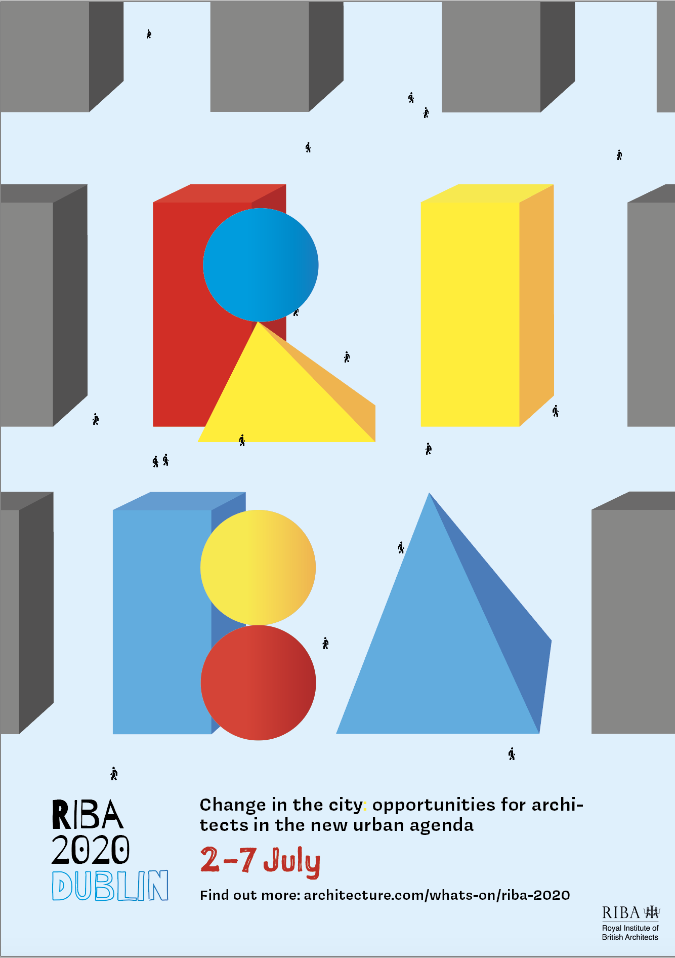
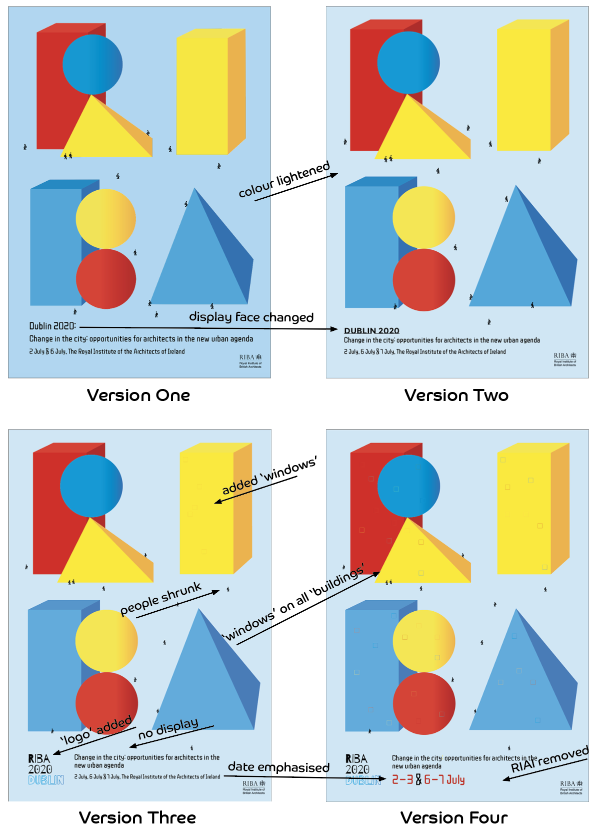
This design was inspired by Kindercore. Kinder means child in German, so this trend is very much influenced by a child’s viewpoint of the world, and, therefore, its buildings. Geometric shapes are very common in graphic design as well as architecture, so this style translated across onto the poster, programme and animation quite well. Limited colour schemes can also be a very impactful tool in catching a user’s attention, so keeping my designs to just the primary colours was an interesting challenge.
My intent for this design was that from far away, the big colourful shapes would catch the audience’s attention, but when up close, they would see the little people and realise they were actually buildings. I repurposed the event logo I made for another poster, and adapted it to the kindercore colour scheme. For the typography, I wanted a hand-drawn aesthetic, as that is how traditional architecture was made. This is why the display font, Sketchnote Square, and the logo look as if drawn by hand.
My intent for this design was that from far away, the big colourful shapes would catch the audience’s attention, but when up close, they would see the little people and realise they were actually buildings. I repurposed the event logo I made for another poster, and adapted it to the kindercore colour scheme. For the typography, I wanted a hand-drawn aesthetic, as that is how traditional architecture was made. This is why the display font, Sketchnote Square, and the logo look as if drawn by hand.